Gothic Portrait: Table of Content
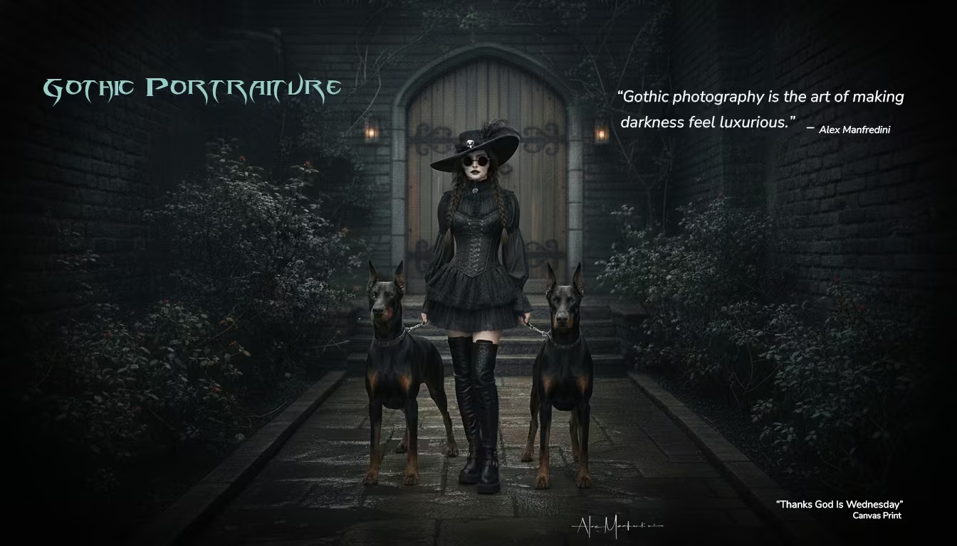
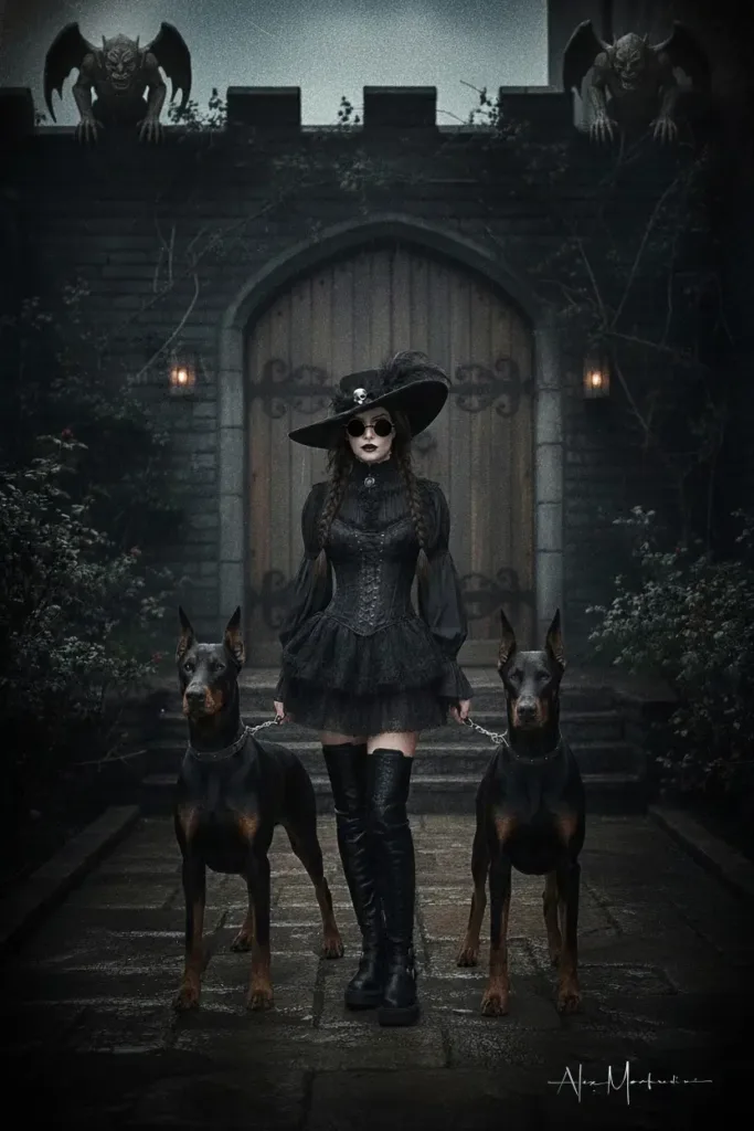
“Thanks God Is Wednesday” – Canvas by Alex Manfredini
The frugal origin of a timeless mood
“Low-key” lighting in gothic portraits exploded in 1940s film noir partly because it was cost-effective. Fewer lamps, more shadow, faster setups. What began as a budget choice became a defining language of mystery and moral ambiguity. Today we borrow that vocabulary for editorial and gothic portraiture—not to hide, but to reveal: character through darkness, elegance through restraint. Let the constraint inspire you. With breathable blacks, sculpted light, and a model directed toward quiet power, your gothic portraits will feel less like photographs and more like scenes from a story the viewer is eager to enter.
How to Direct a Gothic Portrait: Soft Light, Breathable Blacks, and Commanding Presence
Gothic portraiture sits at a beautiful intersection: elegance wrapped in shadow, narrative carved by architecture, and character expressed through micro-gestures. When done well, the image feels like a short film paused at the decisive moment. The viewer senses weather, hears footsteps on wet stone, and wonders what happened a minute before the shutter clicked. In this post, I’ll break down a practical, repeatable approach for crafting a cinematic gothic portrait—lighting, composition, direction, and color—along with concise guidance for the model and a bit of historical trivia that might reframe how you think about constraints.
Why “breathable” blacks matter
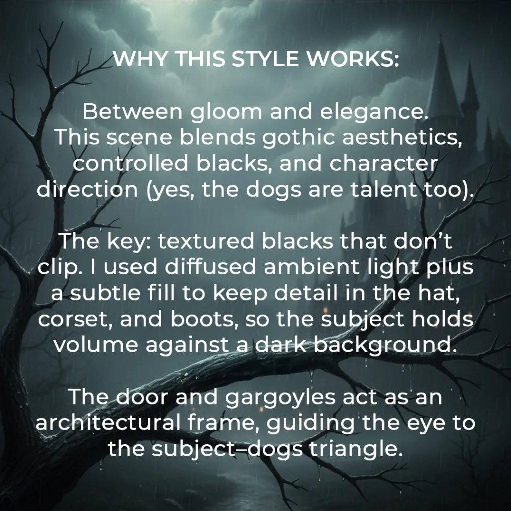
Gothic imagery often lives in a low-key world, but low key shouldn’t mean crushed detail. If your blacks clip, the wardrobe turns into a flat silhouette; you lose texture in lace, leather, feathers, and wool—the very materials that communicate mood. “Breathable” blacks retain micro-contrast and subtle sheen. They feel like velvet you could touch.
How to achieve it:
- Meter for the face. Place skin at a safe midtone so you’re not rescuing it later.
- Protect detail in the darkest textiles. Slightly underexpose the scene overall (by a third stop) if needed, but keep the face clean.
- In post, lift shadows selectively rather than globally. Use curves on the lower quarter, not a blanket exposure boost.
- Add a subtle “matte” toe to your curve. This compresses the deepest shadows so they don’t vanish, preserving air and texture.
- The result is a print-friendly file where black isn’t a void; it’s a character with depth.
Light that sculpts without betraying the mood
Gothic light is softer than many imagine. Overly hard sources can break the illusion by introducing modern glamour cues. I prefer diffused ambient light—think overcast late afternoon or open shade—then a restrained fill to reveal wardrobe detail. If you add a kicker, keep it gentle and cool, so it whispers “moonlight” rather than screams “strobe.”
A simple working setup:
- Key: sky as a massive softbox. Position your subject where the ambient wraps—courtyards, archway thresholds, or just outside a heavy door.
- Fill: a small silver or white reflector placed low and slightly off-axis. The goal is to lift eye sockets and black fabrics, not to change the key direction.
- Background control: flag stray light that flattens the scene. Let the environment fall a half-stop to a stop darker than the face for separation without glow.
Remember: the mood is in the ratio. Keep the subject readable; let the space brood.
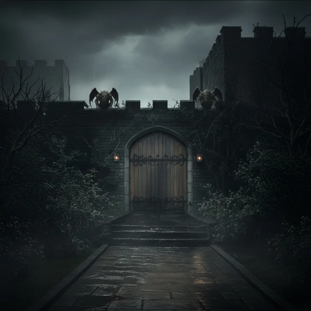
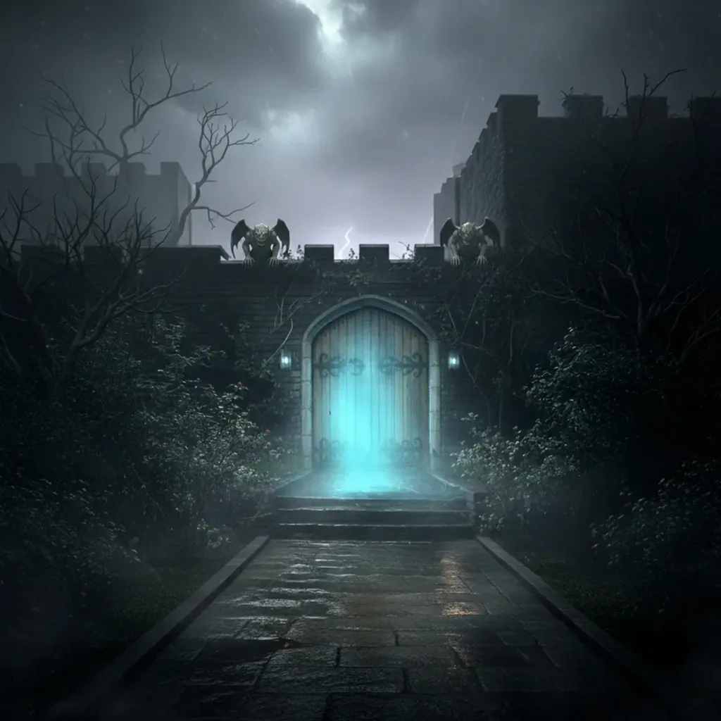
Composition as narrative architecture
Gothic sets love symmetry—and they tempt you to stop there. Symmetry provides solemnity, but narrative arrives when you break it thoughtfully. Use architecture as a frame (doors, arches, gargoyles) and place your subject so the geometry supports posture and intent. Then introduce a purposeful imbalance: a tilt of the hat, one braid forward, a lantern glowing warm against a cool scene. These micro-contradictions pull the eye and hint at story.
Guidelines I rely on:
- Anchor lines: cobblestones, steps, or hedge lines leading to the subject’s feet create a grounded entrance.
- Subject triangle: if you’re working with animals or props, think in triangular groupings to keep energy contained yet dynamic.
- Breathing room: leave a touch more headroom than usual beneath tall hats or architectural arches. The negative space adds grandeur.
Direction: stillness as power
In portraits with strong set design or animal co-stars, the human’s energy should feel sovereign. That doesn’t mean stiff; it means precise. Emotions read through micro-movements—jaw release, lip tension, eyelids, clavicles. Ask for “quiet confidence.” It photographs better than overt drama, which can slide into caricature.
Three compact tips for the model:
- Micro-poses: soft S-curve. Chin slightly down. Look over the glasses. Shoulders relaxed. Elbows a bit off the torso to define sleeves and corset.
- Presence: lead with stillness. Weight balanced. Exhale on the shutter. Mouth relaxed. Think “queen at the gate.”
- Accessories: play with the hat brim and braids. Small angles change the mood. One braid forward for tension; centered for an iconic look.
Give these cues one at a time. Layering them gradually keeps the model present and avoids overwhelm.
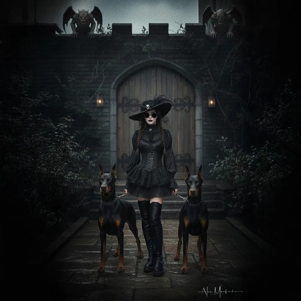
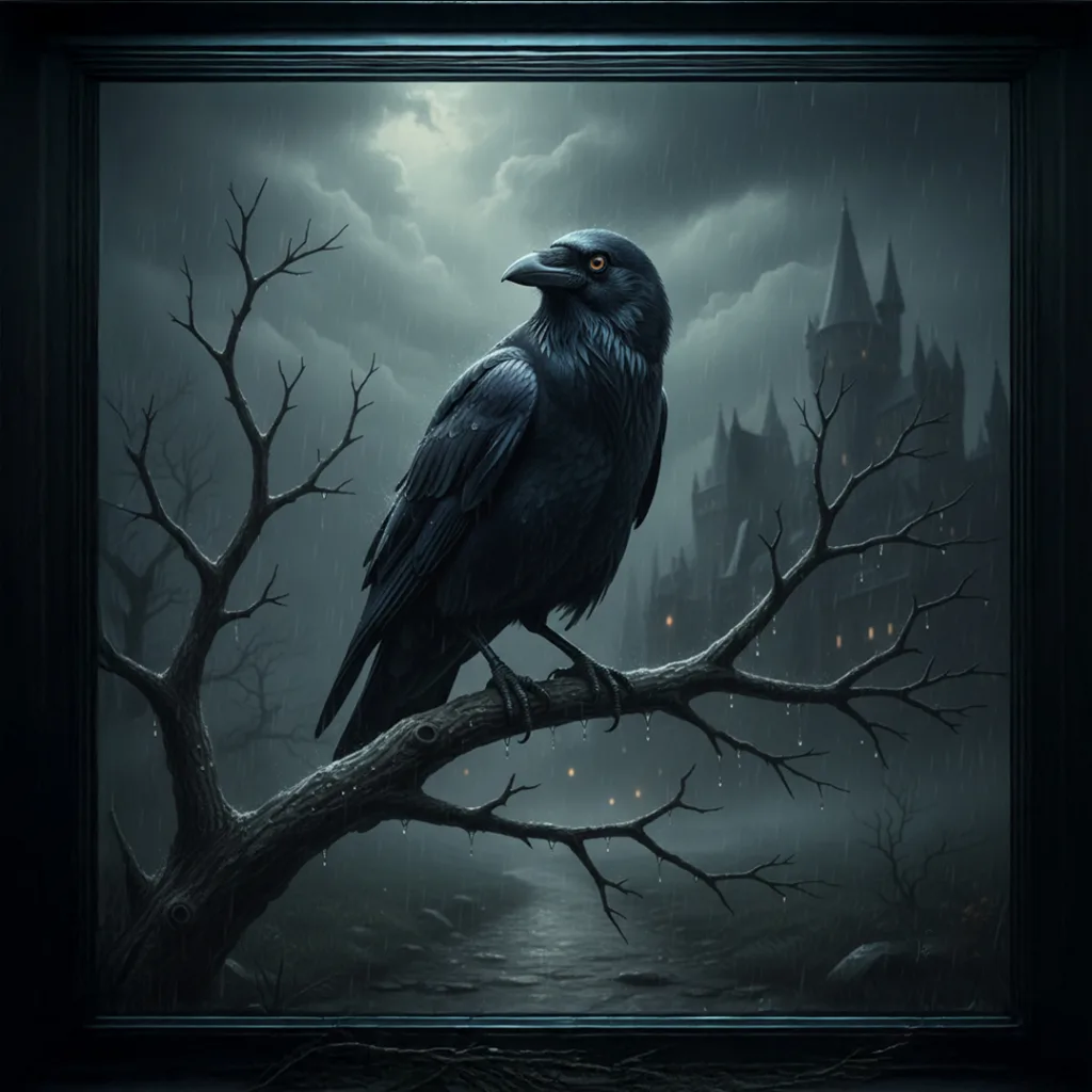
Working with animal talent
Dogs, horses, ravens—gothic motifs love companions. Animals inject life and unpredictability, which is exactly why you must engineer calm. What looks like power in the final frame usually comes from quiet sets and consistent marks.
Handling animal talent
- Attention anchor: station an assistant off-camera with a soft clicker or whisper. Reward when the gaze aligns.
- Staging: pre-visualize pose shapes (sitting, standing, angled) and block them before the model steps in. Then integrate leashes, hands, and negative space thoughtfully.
- Safety and ethics: stable footing, non-slip surfaces, and frequent breaks. Elegance never justifies stress.
Color grading for emotional contrast
The gothic palette sings when cool midtones meet a pocket of warmth. Push blues/greens subtly into shadows and mids, then preserve a small warm zone—skin, a lamp, a wooden door. This cool-warm tension suggests night and life at once.
Workflow:
- Base grade: neutralize white balance for accurate skin and textiles.
- Split tone: bias shadows and mids toward cyan-blue using curves or color wheels; keep highlights closer to neutral.
- Local warmth: brush back warmth on skin or a single practical light. Restraint is key—think ember, not campfire.
For print, test on matte and luster papers; cool grades can go muddy on certain stocks. A gentle bump to midtone contrast often restores presence.
Posing the wardrobe
Wardrobe is architecture you can wear. Corsets, lace, leather, feathers, and tall boots carry shape—if you make space for them. Ask the model to create negative space around elbows and hips; it outlines structure and avoids “black blob” syndrome. Tilt the hat brim a few degrees and watch how the shadow line across the eyes changes the character from enigmatic to severe. Braids can formalize symmetry or inject tension by breaking it—one forward, one back.
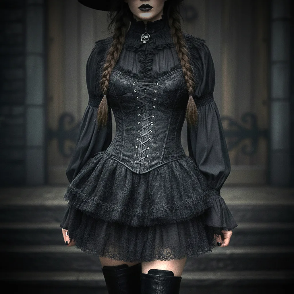
Small choreography ideas:
- Brim reveal: a tiny lift to catch a catchlight, then drop again for mystery.
- Boot line: angle the lead boot slightly outward to echo the arch curves behind.
- Glove tension: a gentle pull of a glove cuff sharpens the mood without theatrics.
The shoot rhythm
Sequence matters. Start with simple, symmetrical frames to “map” the light and give the model a baseline. Once you confirm exposure and ratios, iterate into asymmetry: a half-step forward, a braid repositioned, a chin shift. With animals, capture the clean hero shot early, then play. If your scene includes practicals (lamps), shoot a version without them lit for a crisp option, then a version with warmth for atmosphere.
Keep a small feedback loop: show the model one great frame every few minutes. Confidence elevates posture and micro-expression more than any verbal cue.
Post: preserving the spell
- Clean but keep pores and fabric weave.
- Dodge and burn with restrained, soft brushes. Shape cheekbones, hat texture, and stair edges rather than flattening.
- Grain: a fine, clean grain ties elements together and echoes classic cinema without shouting “preset.”
Export two versions: one optimized for web (sRGB, sharpen for screen), another for print (Adobe RGB or ProPhoto if your workflow supports it). For social media crops, protect the architectural frame—don’t amputate gargoyles or arch keystones.
The psychology of gaze and myth
Gothic portraiture uses archetypes: gatekeeper, witch, sentinel, queen. Instead of instructing “look fierce,” give narrative verbs: guard, welcome, challenge. Verbs are easier to perform than adjectives and produce more grounded expressions. Ask for stillness plus a thought: “Someone you love is behind this door.” The eyes will carry meaning without contortion.
Practical checklist
- Scout for arches, doors, stone textures, and a slightly damp surface (post-rain shine is a bonus).
- Bring a small reflector, a negative fill flag, and gaffer tape.
- Wardrobe with textured blacks; avoid pure matte black that swallows detail.
- Brief the model with the three tips above. Share a single reference image to align tone.
- Have an assistant manage animal attention and safety.
- Shoot a base symmetry, then iterate into controlled asymmetry.
- Grade cool; preserve a pocket of warmth.
©2025 Copyright Alex Manfredini